Arabic and English Logo Design: How to Build a Bilingual Brand Identity
In Saudi Arabia, the UAE and across the Gulf, your customers read in two languages. Your brand should speak both fluently. Yet many logos are designed in English first, and the Arabic is added at the end, often by typing the name in a default font. The result looks like two different companies standing next to each other.
Here is how to build an Arabic and English identity that feels like one brand.
Design both languages from day one
The most important decision is timing. If the Arabic is part of the first sketches, the two wordmarks can share the same proportions, stroke weight and personality. If it comes later, the designer is forced to bend Arabic letterforms to imitate Latin shapes, which rarely looks natural to an Arabic reader.
Match the personality, not the shapes
Arabic and Latin scripts work differently. Arabic is connected, flows right to left, and has a horizontal baseline with ascenders and descenders that behave nothing like English. Forcing Arabic letters to copy English geometry usually breaks them. Instead, decide what the brand should feel like (calm, bold, playful, premium) and express that feeling in each script on its own terms.
Things to align between the two wordmarks
- Visual weight: neither version should look heavier or louder than the other.
- Height and spacing: they should sit comfortably side by side and stacked.
- Details: a shared cut, curve or terminal can tie them together.
- Tone: a modern English wordmark next to a very traditional Arabic one sends mixed signals.
Consider an Arabic-first identity
For brands whose core audience is local, leading with Arabic can be a strong strategic choice. In the Hagar Polyclinic rebrand in Al-Ahsa, the custom Arabic wordmark is a primary part of the system, giving the clinic a distinctive local character instead of a generic international look.
Use cultural references with care
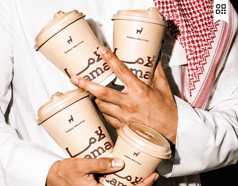
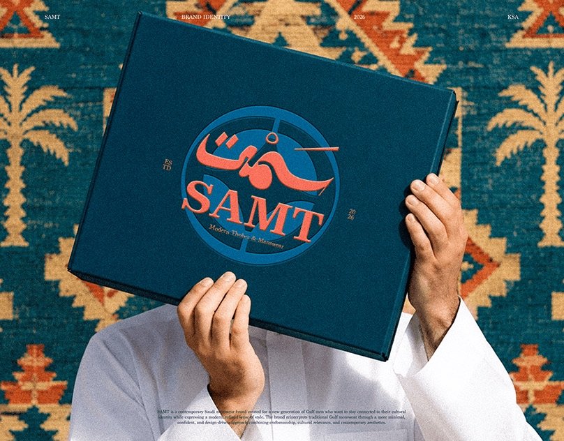
Gulf brands often draw from heritage: calligraphy, Sadu patterns, the desert, the camel. These can be powerful, but when every brand uses them they stop being distinctive. For Lama Café, a Saudi café for Gen Z, we kept the local spirit but chose an unexpected character, the llama, instead of the obvious camel. For SAMT, a Saudi menswear brand, the idea was “presence without noise”: heritage carried forward quietly rather than decorated on the surface.
Pick typefaces that exist in both scripts
Beyond the logo, your brand needs fonts for headlines and body text. Choose type families that include well-designed Arabic and Latin versions, or pair two families carefully by weight and x-height. Check that the Arabic font supports the characters and numerals you need, and test it on mobile, where most of your audience will see it.
Write guidelines for both languages
Your guidelines should show layouts in Arabic and English, how to mirror layouts for right-to-left reading, and what to do when both languages appear together. Without this, suppliers and social media teams will improvise.
A quick checklist
- Arabic and English designed in the same phase.
- Equal visual weight and harmony when placed together.
- Cultural references that are meaningful, not generic.
- Fonts tested in both scripts on real screens.
- Bilingual layout rules in the brand guidelines.
Every identity I build is bilingual from the start. If you are launching or rebranding in the Gulf, see how the visual identity service works or tell me about your project.